Gold rose on Thursday as comments from Israel’s Prime Minister Benjamin Netanyahu about talks with Lebanon, plus a weaker US Dollar, supported demand. Prices moved up towards the $4,800 level.
Netanyahu said he wants direct talks with Beirut, a day after an Israeli attack in Lebanon killed more than 300 people. He said talks would focus on disarming Hezbollah and establishing peaceful relations.
Middle East Talks And Shipping Risks
AFP reported that Lebanon wants a ceasefire before any talks. The Strait of Hormuz stayed largely shut during the first 24 hours of a US-Iran two-week truce, with 5 vessels passing through versus about 140 per day before the war.
WTI traded near $95.60, down 0.13%, while the US Dollar Index fell 0.30% to 98.63. The US 10-year yield slipped 2 basis points to 4.279%.
US GDP rose 0.5% year-on-year in the last quarter of 2025 versus expectations below 0.7%. Core PCE inflation eased from 3.1% to 3% year-on-year, while Initial Jobless Claims rose to 219K and Continuing Claims fell to 1.794 million.
Markets priced 7.5 basis points of rate cuts by year-end. Friday’s CPI is forecast at 3.3% headline (from 2.4%) and 2.7% core (from 2.5%), alongside Michigan sentiment data.
Gold Outlook And Positioning
We saw hopes for Middle East de-escalation a few months ago with potential Israel-Lebanon talks and a US-Iran truce. However, the situation remains tense, as the Strait of Hormuz is still operating at a fraction of its normal capacity of over 90 tankers a day. This continued uncertainty provides a strong underlying reason for holding gold.
The economic weakness we saw in late 2025, with just 0.5% GDP growth, has persisted into the first quarter of 2026. As was expected, the March CPI report came in hot, and inflation remains stubbornly above the Fed’s 2% target, with the latest figures still hovering near 2.8%. This environment of slow growth and sticky inflation increases the appeal of gold as a store of value.
Because of this persistent weakness, traders are now pricing in at least 50 basis points of Fed rate cuts by the end of the year, a significant shift from the mere 7.5 points expected a couple of months ago. This has kept pressure on US Treasury yields, with the 10-year yield now trading closer to 4.15%. A weaker dollar and lower yields are classic tailwinds for bullion.
This environment of high uncertainty and potential for sharp price moves makes options attractive. We believe traders should consider buying call options or implementing bull call spreads to target a move toward the $5,000 psychological level. This defines your risk while maintaining exposure to the upside if geopolitical or economic news pushes gold higher.
For those trading futures, the technical levels mentioned previously remain critical. A sustained break above the $4,857 resistance opens the door for a quick run higher. However, we must watch the 20-day moving average, now around $4,750, as a key level of support; a break below it could signal a sharp, short-term correction.
In the first week of the conflict, the renminbi (CNY) was the best-performing currency, with volatility kept under control. Analysis focused on whether it was acting as a secondary safe haven after the US dollar, supported by stronger energy resilience than savings-heavy Asia-Pacific peers.
Flow data showed CNY buying matched large outflows from Chinese Government Bonds (CGBs). For most of the year, CNY and CGB holdings moved in opposite directions, with CNY purchases linked to the unwinding of CGB positions amid worries that higher inflation could reduce real rates.
Shift In Flow Dynamics
Toward month-end, demand for CGBs picked up again, while CNY flows moved back to net selling, consistent with increased hedging. Early Q2 data then showed both CNY and CGBs being net bought at the same time.
This pattern suggests rising outright CNY exposure, even with low relative yields and continued People’s Bank of China resistance to real effective exchange rate (REER) appreciation. An alternative reading is that reflation in China is beginning for the first time since the post-pandemic reopening, and that expectations for front-end yields may be incorrect, alongside an easing-leaning Federal Reserve even before the ceasefire was announced.
Looking back at the conflict in early 2025, we saw the CNY act as a safe haven, but this was initially tied to investors selling Chinese government bonds (CGBs). That inverse relationship, where money moved out of bonds and into the currency, was a consistent theme for much of last year. However, a significant shift began around the second quarter of 2025, when we started observing simultaneous net buying of both CNY and CGBs.
This trend of dual inflows appears to be continuing into 2026, suggesting investors are now seeking outright exposure to Chinese assets. Recent data confirms this, with foreign holdings of CGBs showing a net inflow of over ¥80 billion in March 2026, marking the fourth straight month of gains. This indicates a growing confidence that is not just about parking cash in the currency, but investing in the country’s debt market with less currency hedging.
Implications For Traders
For derivative traders, this persistent demand and the People’s Bank of China’s preference for stability mean that currency volatility is likely to remain low. Implied volatility on one-month USD/CNY options has recently fallen near multi-year lows, making strategies that profit from low volatility, such as selling strangles, more attractive. The expectation is for controlled, gradual movements rather than sharp breaks.
The potential for genuine reflation in China, a possibility we first noted in 2025, is now supported by a stable 5.1% GDP growth figure for the first quarter of 2026. This economic stability, coupled with a Federal Reserve that has already enacted several rate cuts and is now signaling a pause, alters the risk-reward for holding Chinese assets. The interest rate differential between the U.S. and China is no longer widening, providing fundamental support for the yuan.
Therefore, traders should consider that the old playbook of hedging all CGB exposure may be less effective now. The simultaneous buying of the currency and bonds suggests that outright long CNY positions or options strategies that benefit from a stable-to-stronger yuan are becoming more viable. This reflects a structural change in how global markets view Chinese assets, treating them less as a tactical trade and more as a core holding.
The US Dollar Index (DXY) fell to around 98.80 after the US PCE report showed inflation was still sticky, keeping the Federal Reserve cautious. An upside surprise in Initial Jobless Claims and lower US Treasury yields added pressure to the dollar.
Geopolitical news turned slightly calmer after an Israeli official said operations in Lebanon could ease soon due to US pressure, and Israel signalled direct talks with Lebanon on Hezbollah disarmament. Military activity continued and risks in the region stayed elevated.
Major Fx Moves And Market Tone
EUR/USD rose towards 1.1700 on lower US yields and slightly better risk sentiment, while GBP/USD recovered near 1.3430 as the dollar softened. USD/JPY hovered near 159.00 as falling yields reduced carry appeal, and AUD/USD edged up near 0.7080.
WTI oil stayed elevated but steadied as fears of immediate supply disruption eased, while the wider Middle East conflict continued to support prices. Gold held near $4,771, aided by a softer dollar, lower yields, and ongoing geopolitical risk.
Friday, April 10 data includes Germany HICP, Canadian employment, US CPI, US factory orders, the US Michigan Consumer Index, UoM 1-year and 5-year inflation expectations, and the US monthly budget statement.
WTI is a US-sourced light, sweet crude priced via the Cushing hub, and is one of three main benchmarks alongside Brent and Dubai. Prices are driven by supply and demand, geopolitics, sanctions, OPEC decisions, the US dollar, and US inventory data from API and EIA, which are within 1% of each other 75% of the time.
Fed Inflation Labor Market Tradeoffs
The Federal Reserve is in a difficult position, caught between inflation that remains high and a labor market that is beginning to show weakness. We saw this trend develop through the second half of 2025, when core inflation averaged a stubborn 3.1% even as weekly jobless claims climbed steadily, recently reaching a 15-month high of 245,000. This conflict creates significant uncertainty about future interest rate moves, making conviction trades on the Fed’s direction very risky in the coming weeks.
Given this uncertainty, we should prepare for high volatility, especially around today’s critical US Consumer Price Index (CPI) release. Options strategies that profit from large price swings, such as long straddles on equity index futures or major currency pairs like EUR/USD, could be prudent. This approach allows us to capitalize on a market shock without needing to predict the exact direction of the move.
The US Dollar’s decline is a direct response to falling US Treasury yields, as the market begins to price in the possibility of earlier interest rate cuts. This pattern is reminiscent of the price action from mid-2024, when the dollar weakened for several months after initial signs of an economic slowdown appeared. We should therefore consider positioning for further dollar weakness against currencies backed by central banks with a more hawkish stance.
For oil traders, reports of potential de-escalation between Israel and Lebanon have put a temporary cap on WTI prices, though the broader regional tension provides a solid floor. The decision by OPEC+ last month to maintain production cuts reinforces this price support, likely keeping crude oil in a tight range. This environment makes selling out-of-the-money call options a viable strategy to generate income from elevated premiums.
Gold is benefiting from both the geopolitical risk premium and the drop in US yields, which lowers the opportunity cost of holding a non-yielding asset. With the US 10-year yield slipping below 4.0% this past week, the fundamental case for gold remains strong. Any price dips should be seen as potential buying opportunities, particularly if today’s inflation data from the US and Germany surprises to the upside.
The immediate market direction hinges entirely on today’s dense economic calendar, with the US CPI and Canadian employment data being the most important releases. A hot US inflation number would challenge the narrative of impending rate cuts and could cause a sharp rebound in the dollar. Conversely, a weak Canadian jobs report could create a compelling opportunity to buy USD/CAD, especially if US data is also strong.
Taiwan entered 2026 with strong growth and low inflation, supported by global demand for AI-related exports and easing US tariff pressures. The outlook for 2Q 2026 is now under pressure from higher energy prices linked to tensions in the Middle East and from softer export momentum.
The report links the US–Israel–Iran conflict to disruption in global energy markets and supply chains. It says leading indicators point to rising inflation and moderating exports in 2Q.
Key Leading Indicators
In March, PMI data showed a sharp rise in input costs, reaching levels last seen during the Russia–Ukraine war in 2022. The same data also showed a modest fall in export orders.
The inflation forecast (CPI) was revised to 1.9%, while the GDP growth forecast was kept at 7.0%.
We see the current “Goldilocks” environment for Taiwan as highly fragile, presenting clear opportunities in the weeks ahead. The primary catalyst is the energy shock stemming from Middle East tensions, which is now the main driver of market risk. With Brent crude recently breaking past $110 a barrel, we are looking at trading strategies that benefit from sustained high energy prices and rising inflation.
This situation suggests going long on oil futures or buying call options on energy-related assets to capitalize on further price increases. The March PMI data, showing input costs at levels not seen since the 2022 conflict in Ukraine, confirms this inflationary pressure is already filtering through the economy. This makes inflation-linked derivatives attractive as a way to hedge against or profit from the rising consumer price index.
Equity Volatility And Currency Pressure
On the equity side, the threat to exports puts the recent AI-driven rally at risk. While tech demand carried the TAIEX index to record highs through late 2025 and early 2026, we are now advising caution. We believe purchasing put options on the TAIEX or on key semiconductor stocks is a prudent way to hedge against a potential downturn as export orders soften.
The clash between strong AI fundamentals and new macroeconomic headwinds is increasing market uncertainty. Implied volatility on TAIEX options has already ticked up by 5% over the last two weeks, signaling that larger price swings are expected. This environment is ideal for volatility-based strategies, such as straddles, which can profit from a significant market move in either direction.
Finally, we anticipate the New Taiwan Dollar will face downward pressure. Slower export growth combined with a global flight to the safety of the US dollar could weaken the currency from its current levels. We have observed the TWD slide 1.5% against the dollar this month, and we expect this trend to continue, making long positions in USD/TWD futures a compelling trade.
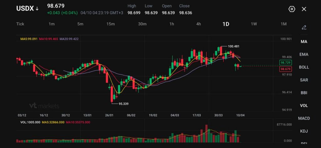
USDX trades at 98.679, up 0.043 (+0.04%), but it remains on track for a weekly drop of more than 1%.
A two-week US-Iran ceasefire and lower oil prices have eased the inflation shock that supported the dollar through March.
One-year US inflation expectations rose to 3.4% in March from 3.0% in February, while expected gasoline-price inflation jumped to 9.4%.
The dollar is no longer trading with the same urgency that drove it higher through the worst of the Iran shock. USDX is holding near 98.679, a modest rebound on the day, but still well below the recent peak at 100.481. The main reason is straightforward.
A two-week ceasefire has reduced the immediate need for safe-haven positioning, and the drop in oil has pulled out part of the inflation premium that had been supporting the greenback.
The dollar and oil are trading in lockstep in the wake of the US-Iran ceasefire this week, tightening the relationship between them to near-record levels https://t.co/raserekvOB
That has changed the tone, but not the full structure. The ceasefire is temporary, Hormuz traffic is still not fully normal, and markets are still treating the current calm as conditional rather than durable. That keeps the dollar softer than it was, but not yet in a clean bearish trend.
Lower Oil Has Softened the Dollar’s Main Support
The dollar’s March strength came from two linked forces: war risk and higher-for-longer rate pricing. Oil fed both. Once crude fell sharply after the ceasefire announcement, the market had less reason to keep chasing the dollar higher.
The dollar fell against all its major peers after the US and Iran agreed to a two-week ceasefire, sapping demand for the currency as a haven https://t.co/4voiHcsucM
That matters because the US still benefits when energy shocks hurt importers more than exporters, but that advantage narrows when crude retreats. The market is now pricing in a less severe inflation spillover than it was one week ago, which has made defensive dollar longs less attractive.
The problem for dollar bears is that oil has eased, not normalised. Shipping disruption, political uncertainty, and the risk of renewed escalation still leave a residual premium in rates and currencies.
Inflation Still Limits the Downside
The dollar has weakened, but inflation risk remains high enough to prevent the market from rebuilding an easy Fed-cut story. March survey data showed one-year inflation expectations rising to 3.4% from 3.0%, while expected gasoline-price inflation jumped to 9.4%, the highest since the 2022 energy shock.
That keeps the rates backdrop sticky. A lower dollar usually needs either cleaner disinflation or visibly weaker growth data. Right now, the market has neither.
The ceasefire has cut one part of the problem, but households are still expecting higher fuel costs, and businesses are still facing elevated logistics prices.
That is why the dollar is slipping in an orderly way instead of breaking lower.
CPI is the Next Real Test
The next move in USDX depends on whether the upcoming CPI data confirms that the conflict has already filtered into broader price pressure. Service data has already pointed in that direction. Input prices rose at the fastest pace in more than 13 years, while growth slowed, which is exactly the kind of mix that makes central banks cautious.
Investors in the $31 trillion Treasury market are going into a closely-watched report on consumer prices hedging against more losses in government bonds, as a fragile truce between the US and Iran takes hold. https://t.co/7gFvFLEekL
If CPI comes in firm, the dollar can stabilise quickly because traders will go back to higher-for-longer thinking. If CPI lands softer than feared, the latest pullback can extend because the market will have room to remove more of the inflation premium that built through March.
That leaves the dollar trading off two clocks at once: the truce clock and the inflation clock.
USDX Technical Outlook
The US Dollar Index (USDX) is trading near 98.68, continuing its pullback after failing to sustain gains above the 100.48 high. Price action shows a clear shift in momentum, with a series of lower highs forming and recent candles reflecting sustained selling pressure.
The move lower has now pushed the index beneath key short-term support, suggesting the bullish phase has paused and a corrective structure is developing.
From a technical standpoint, the trend is tilting bearish in the short term. Price is trading below the 5-day (99.09) and 10-day (99.46) moving averages, both of which are turning lower and acting as immediate resistance.
The 20-day (99.42) is also flattening and beginning to roll over, reinforcing the loss of upside momentum. This alignment indicates that rallies are likely to face selling pressure unless the index can reclaim higher ground.
Key levels to watch:
Support: 98.70 → 97.90 → 96.40
Resistance: 99.40 → 100.00 → 100.50
The immediate focus is on the 98.70 zone, which price is currently hovering around. A sustained break below this level could open the path toward 97.90, where stronger support may emerge.
On the upside, 99.40 now acts as near-term resistance. A move back above this level would suggest stabilisation and could lead to a recovery toward the 100.00 handle.
Overall, USDX is showing signs of short-term weakness after rejecting the 100 level. The structure now favours consolidation or further downside unless buyers can regain control above the 99.40–100.00 region.
What Traders Should Watch Next
The market is now weighing three variables together: whether the ceasefire holds, whether shipping through Hormuz improves enough to keep oil lower, and whether CPI confirms or challenges the inflation story.
A stable truce and softer inflation would likely keep pressure on the dollar. A renewed threat to Hormuz or a hotter inflation print would likely pull buyers back quickly.
Why is the Dollar Index Holding Near 99 Instead of Falling More Sharply?
The dollar has lost part of its war-driven safe-haven premium, but traders have not fully abandoned it because the ceasefire is temporary, Hormuz disruptions have not fully cleared, and inflation risk is still high. Recent market coverage also showed the dollar stabilising after touching a one-month low near 98.525.
What Caused the Weekly Drop in USDX?
The biggest driver was the two-week US-Iran ceasefire, which helped push oil lower and reduced fears of a more immediate inflation shock. That made defensive dollar positioning less urgent than it was during the worst of the March energy spike.
Why Does Oil Still Matter for the Dollar Even After the Ceasefire?
Oil still shapes inflation expectations and Fed pricing. Even after the truce, Brent and WTI remained elevated because the market still doubts how quickly flows through Hormuz can normalise. As long as energy stays expensive, the dollar keeps some support from higher-for-longer rate expectations.
Why Hasn’t the Ceasefire Fully Reversed Safe-Haven Demand?
Because the pause looks fragile. Market reports still describe the truce as uncertain, with continued attacks in the region and ongoing limits on ship crossings through Hormuz. That keeps traders from treating the current calm as a full resolution.
What Are Markets Waiting for Next on the Macro Side?
The next major test is US March CPI. Inflation expectations have already moved higher, and the market wants to see whether the oil shock has started feeding into official price data strongly enough to keep the Fed cautious.
Start trading now – Click here to create your real VT Markets account
Written on April 10, 2026 at 8:15 am, by josephine
Argentina’s industrial output (non-seasonally adjusted) fell by 8.7% year-on-year in February. This was down from a 3.2% decline in the previous reading.
The result shows a sharper contraction in industrial production compared with the prior period. It indicates weaker output than a year earlier.
Given the sharp acceleration in the decline of Argentina’s industrial output, we see this as a strong signal of a deepening economic contraction. This trend suggests increased stress on corporate earnings and overall economic activity. Traders should prepare for heightened bearish sentiment surrounding Argentine assets.
The weakening economy will almost certainly put downward pressure on the Argentine Peso (ARS). We anticipate further currency devaluation, making short positions on the ARS attractive. This could be executed by selling ARS futures or purchasing put options to speculate on its decline against the US dollar.
This industrial slump will directly impact the Merval stock index, as many of its largest components are industrial companies. We believe there is a strong case for buying put options on the Merval index or on ETFs that track Argentine equities. This strategy would profit from the expected downturn in the stock market over the next few weeks.
Recent data confirms this is not an isolated issue, as construction activity also posted a year-on-year decline of over 24% for February 2026. This broad-based weakness reinforces the view of a severe recession. The government’s austerity measures, a core policy since the reforms initiated in 2025, appear to be contracting the economy more than anticipated.
Despite the recessionary data, we just saw March’s monthly inflation come in at a stubborn 15%. This puts the central bank in a difficult position, making it unlikely to cut interest rates to stimulate growth. This policy bind will likely extend the economic pain and asset price depreciation.
The risk of sovereign default is rising, with Argentina’s country risk premium now hovering near 1,900 basis points, a significant increase over the past quarter. This makes buying credit default swaps (CDS) on Argentine government bonds a prudent move to hedge against, or profit from, increasing credit risk. This is a level not seen since the debt restructuring fears of early 2024.
Overall uncertainty creates a volatile environment, suggesting that options premiums will likely rise. We see an opportunity in strategies that benefit from large price swings, regardless of direction. Establishing long straddles on the most liquid Argentine assets could be an effective way to trade the expected turbulence.
Written on April 10, 2026 at 8:02 am, by josephine
Please note that the dividends of the following products will be adjusted accordingly. Index dividends will be executed separately through a balance statement directly to your trading account, and the comment will be in the following format “Div & Product Name & Net Volume”.
Please refer to the table below for more details:
The above data is for reference only, please refer to the MT4/MT5 software for specific data.
If you’d like more information, please don’t hesitate to contact info@vtmarkets.com.
WTI crude oil fell on Thursday, giving up earlier gains as markets became calmer about the US-Iran ceasefire. It traded near $92.00 a barrel after reaching $95.20 earlier in the day.
WTI dropped nearly 10% on Wednesday after the United States and Iran agreed to a two-week truce. Doubts later rose after Iran said three parts of the ceasefire had been breached following Israeli strikes on Lebanon.
Ceasefire Uncertainty Drives Volatility
Israel said the ceasefire does not cover its conflict with Hezbollah in Lebanon. Iran said it does and warned it could leave the deal if attacks continue.
These events raised worries about disruption to shipping through the Strait of Hormuz. MarineTraffic data showed the first non-Iranian oil tanker has passed through the strait since the ceasefire was announced.
Israeli Prime Minister Benjamin Netanyahu said he told his cabinet to start direct talks with Lebanon. NBC, citing a US official, reported President Donald Trump urged Israel to cut back strikes on Lebanon to support talks with Iran.
Saudi Arabia reported halted operations at several energy sites after attacks, via the Saudi State News Agency. The Khurais and Manifa fields were hit, cutting about 300,000 bpd each, and damage to the East-West pipeline reduced throughput by about 700,000 bpd.
Market Strategy And Risk Management
Looking back at the events of 2025, we are reminded of how quickly geopolitical headlines can whip the oil market around. The near 10% price drop followed by a sharp rebound on the fragile US-Iran ceasefire showed extreme volatility. This memory of WTI swinging from over $95 down to the low $90s in a day serves as a critical lesson for today’s market.
Given that experience, we should be prepared for sudden price swings driven by news rather than just supply-and-demand fundamentals. A smart play would be to use options to bet on this volatility itself. For instance, strategies like long straddles or strangles, which involve buying both a call and a put option, could profit from a large price move in either direction.
However, the situation today on April 10, 2026, is fundamentally different and suggests less immediate upside risk. The latest International Energy Agency (IEA) report revised global oil demand growth for 2026 down to a modest 1.2 million barrels per day, citing a sluggish economic outlook in Europe and parts of Asia. Furthermore, recent data from the US Energy Information Administration (EIA) shows a consistent build in commercial crude inventories over the last four weeks, reaching their highest level since last summer.
With WTI currently trading around a calmer $85 per barrel, the high implied volatility that made options expensive during last year’s crisis has subsided. This makes it a more affordable time to purchase protection against unexpected events. We can consider buying out-of-the-money call options as a cheap hedge against a sudden flare-up in Middle East tensions.
The Saudi supply disruptions from 2025, which took over a million barrels per day offline, highlight how vulnerable infrastructure remains. Even with today’s softer demand picture, we cannot ignore the risk that a similar event could send prices soaring past $90 again. Therefore, a defined-risk strategy like a bull call spread could allow us to profit from a modest price rise while capping our potential losses.
Asian currencies have remained steady alongside a weaker US Dollar, despite renewed tensions around a two-week ceasefire in the Middle East that is less than a day old.
Market sentiment has stayed relatively positive, with Asian exchange rates holding up so far even as the ceasefire shows early strains.
Asian Currencies Hold Firm
Physical oil flows through the Strait of Hormuz are still constrained. Ship traffic has improved in the number of vessels leaving the Strait, supported by tolls from Iran, the Oman route, and diplomatic talks.
Overall traffic levels remain low and are still focused more on ships and tankers departing than entering the Strait of Hormuz.
The note advises a cautious approach to risk and recommends hedging exposure to Asian emerging market currencies viewed as more vulnerable, including INR, PHP, THB, and KRW.
Hedging Strategy For Vulnerable Currencies
The article states it was produced with the help of an artificial intelligence tool and reviewed by an editor.
Despite a weaker dollar and stronger Asian currencies, we see a serious disconnect between buoyant financial markets and the physical reality in the Middle East. The two-week ceasefire appears extremely fragile, with recent reports of minor skirmishes already casting doubt on its survival. The core issue for us remains the constrained flow of oil through the Strait of Hormuz.
Maritime intelligence data shows tanker transits are still down nearly 40% from levels we saw in late 2025, a clear sign of underlying tension. This has been reflected in energy markets, where Brent crude volatility spiked to a three-month high of 45% just this week. These physical market indicators suggest the current calm in currency markets is temporary.
The recent strength in currencies like the Indian Rupee (INR), Thai Baht (THB), and Korean Won (KRW), which have all gained over 1.5% against the dollar in the past ten days, presents a valuable window of opportunity. We view these levels as an attractive entry point to protect against a sudden reversal. Traders should use this strength to establish hedges rather than chase the rally.
Specifically, derivative traders should consider buying put options on these vulnerable currencies, such as the THB or INR, for the coming weeks. This acts as insurance, providing downside protection at a relatively low cost if the ceasefire collapses and oil fears trigger a rapid flight to safety. The current low implied volatility in forex options makes these hedges cheaper than they might be in a full-blown crisis.
We must remember the market’s initial underestimation of geopolitical events back in 2022, where early optimism gave way to a sharp and prolonged risk-off period. The present situation feels similar, where financial assets are not accurately pricing in the significant physical risks on the ground. Therefore, caution and proactive hedging are the most prudent strategies for the weeks ahead.
Global manufacturing PMI fell from 51.8 in February to 51.3 in March, after reaching a 44-month high in February. The fall was linked to the escalation of the US/Israel–Iran conflict, which began on 28 February.
Emerging markets, including China and India, led the weakening in manufacturing conditions. Developed markets appeared stronger, partly because delivery times became longer.
Global Supply Chains Under Stress
Longer delivery times were presented as a sign of supply disruption connected to the Iran conflict. A global supply bottlenecks index moved back into “dominant supply bottlenecks/excess demand” territory.
The report also pointed to higher input and output prices and rising global inflationary pressures. It referred to an upward adjustment of inflation forecasts for the eurozone, the Netherlands, the US and China.
The article was produced using an Artificial Intelligence tool and reviewed by an editor.
Looking back to the events of early 2025, we saw how quickly a geopolitical shock like the Iran conflict could impact global manufacturing. The PMI then dropped from a 44-month high as supply bottlenecks re-emerged almost overnight. This serves as a key reminder of how sensitive supply chains are to regional instability.
Positioning For Volatility
Currently, we are seeing some echoes of that period, creating an environment ripe for volatility. Although the latest S&P Global US Manufacturing PMI for March 2026 showed expansion at 52.5, the prices paid sub-index saw its sharpest increase in over a year. This suggests inflationary pressures are building beneath the surface, much like they did in 2025.
This trend is reinforced by the latest inflation data, with the March 2026 US Consumer Price Index coming in slightly above expectations at 3.1%. The persistence of this inflation means that market expectations for interest rate cuts may be too optimistic. This increases the likelihood of a “higher for longer” rate environment, which will directly impact valuations.
Given this, traders should consider buying protection against sudden market swings. Purchasing VIX call options or using straddles on major indices can be an effective way to hedge against rising uncertainty. These positions will benefit from an increase in implied volatility, which often accompanies geopolitical or economic surprises.
In commodity markets, the impact of supply constraints is already visible, with Brent crude recently climbing above $92 a barrel due to new shipping disruptions. We should use call options on oil and other industrial metals to gain upside exposure to further supply-driven price shocks. This allows for participation in price rallies while clearly defining our maximum risk.
The expectation of delayed rate cuts should also keep the US dollar strong. We can use options on currency pairs to position for continued dollar strength against currencies from more dovish central banks. Furthermore, executing interest rate swaps can help hedge existing portfolios against the risk that interest rates do not fall as anticipated.